Revamp the biggest insurance aggregator app
How applying design thinking resulted in 20% growth and gained back our market share.
How It All Started: A Five-Year-Old App
Right after I convinced top management to launch a research department — mainly to help us spend smarter and make better product decisions — we got our first real challenge. We had to revamp a five-year-old app that hadn’t been touched in a while. We were losing market share fast to a competitor that, ironically, was just copying us. But they had something we didn’t: better experience. Our app was still running as a mobile web view, with outdated screens and a flow that didn’t match user expectations. It was overdue. Honestly, I was surprised by how long the Saudi market tolerated it — but it was clear that patience was running out.
The moonwalk: Defining the Problem Backwards
As mentioned earlier, the problem wasn’t clearly defined from the start. We weren’t handed a neat brief or a user pain point to solve — we just had the results of something going wrong. Sales were dropping, users were leaving, and a copycat competitor was gaining traction fast.
Ironically, the company didn’t even have a proper marketing department. The entire “team” consisted of a couple of graphic designers, a media buyer, and a performance marketing specialist. That meant no segmentation, no clear personas, no real understanding of our customers' pain points.
So, we had to reverse-engineer everything.
Using tools like Google Analytics and Hotjar, we tracked user behaviors and grouped our customers into cohorts — especially the most frequent users and the ones spending the most money. These would become our key sample for interviews and insights.
At the same time, the app was clearly outdated. Even before we talked to users, it was obvious that the interface broke many UX best practices. For example — why would a mobile app still have a footer? That was a red flag on its own.
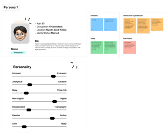
We also brought in an external research agency to conduct focus groups and one-on-one user interviews. Once we collected the insights, we jumped into the design thinking process and started defining real user personas based on actual data.
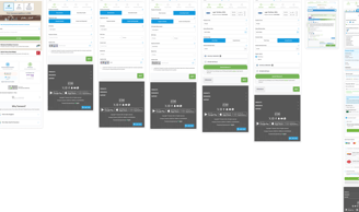
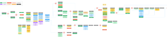
Original app flow
👥 Roles and Responsibilities
This was a group project with two other colleagues. I acted as the lead researcher. My responsibilities included conducting in-depth research, analyzing user behaviors through tools like Google Analytics and Hotjar, developing personas, performing competitive audits, and crafting wireframes to redefine the user experience.
🗺️ Scope
The project scope encompassed a comprehensive overhaul of the Motor insurance app, focusing on redesigning the user interface, optimizing user flows, finding gaps, and introducing upselling.
⚠️ Challenges
Our team faced several significant challenges throughout the project:
Securing Data Access and Buy-In: Obtaining access to necessary data and gaining support from the Business Intelligence team and other departments required extensive communication. We had to clearly articulate the need for change and the importance of research-driven decision-making.
Gaining Leadership Support: Delivering a persuasive presentation to the Chief Strategy Officer was essential to gaining approval and support for the project. We needed to demonstrate the value of research in informing strategic decisions.
Scope and Timeline Challenges: The project scope exceeded the allotted timeline, posing challenges in meeting deadlines and deliverables. Additionally, the absence of established processes and guidance necessitated leadership in creating frameworks and coaching team members.
⛓️Constraints
Integrating the app with multiple insurance companies brings some key challenges to the project:
Technical Complexity: Each insurance company operates on different systems and data formats, making it tricky to integrate smoothly and ensure consistent data exchange.
Compliance Demands: Meeting the specific regulatory and compliance requirements of each insurance company as well as the Saudi Insurance Authority adds complexity to the project’s design and implementation.
Integration Risks: Changes or delays in integration plans from insurance partners can disrupt project timelines and require adjustments to the design and development process.
Time Constraint: 14 weeks
🔍 Process
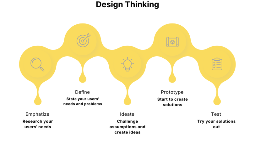
To fix the mess and rebuild properly, we followed the Design Thinking process — a step-by-step approach that helped us move from confusion to clarity. It gave us a structure to work with, especially when we had no clear starting point.
Now, design thinking isn’t just a checklist. Each phase — Empathize, Define, Ideate, Prototype, and Test — can include many tools and activities. The real challenge is knowing which tools to use based on your own situation. And in our case, we were very aware of our constraints:
✅ Limited time
✅ No in-house research infrastructure
✅ Integration with multiple insurance providers
✅ Tight budget in the beginning
So, we didn’t just follow the theory blindly. We chose what worked best for us in each phase. For example, we outsourced focus groups to a research company, used Hotjar and Google Analytics for behavior tracking, and leaned heavily on heuristics to spot broken UX patterns right away.
Also, I won’t go into the nitty-gritty of every task — but some of them were a whole job on their own. For instance, running the focus groups meant we had to prepare recruitment screeners to select the right users. These things take time, and they matter.
And like any real-world project, not everything worked.
We also tried surveys as a fast way to gather insights, but they didn’t convert well — just a 4% response rate, even after sending emails and SMS campaigns. It cost us more than what we got in return. But that’s how it is: some paths work, and some don’t — and both are useful to learn from.

🧏♂️ Empathy
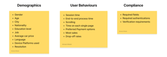
This phase is where everything starts. In the Design Thinking process, empathy means putting yourself in the user’s shoes — but first, you need to know whose shoes you’re stepping into.
That’s why segmentation is critical here. For example, if your users are mostly elderly, that changes how you design your app — from the flow and typography to the wording in your UX. It’s a completely different story if your audience is digital-first Gen Z, or insurance brokers using the app daily for work.
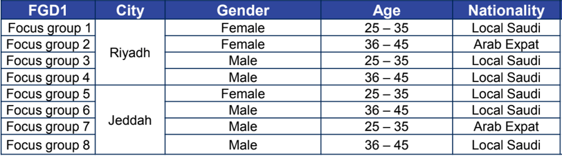
We partnered with a third-party research company to conduct a series of focus groups. I worked closely with them to review and edit the, recruitment screeners, discussion guides, monitored and participated in the sessions to make sure we were getting the depth we needed from each conversation.
We decide 8 sessions of 10 people, is good enough an budget friendly option.
🎯Define
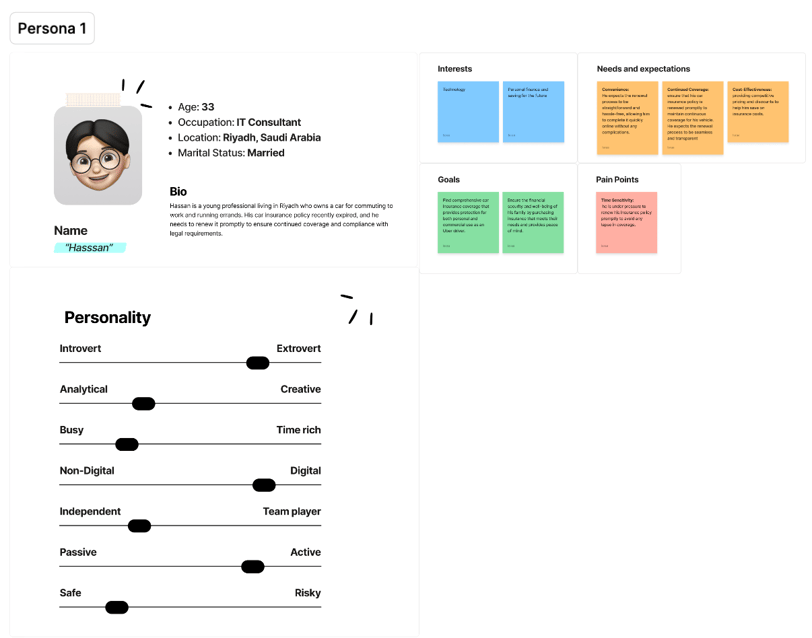
Once we had enough raw insights and observations, it was time to make sense of it all. This phase was all about connecting the dots, turning what we heard and observed into something actionable. We revisited all the focus group notes, Hotjar recordings, and analytics patterns, then started synthesizing them to define user personas, identify key user journeys, and pinpoint where things were breaking.
💡Ideate
At this stage, we had the problem, the personas, and the insights — now it was time to turn all of that into ideas.
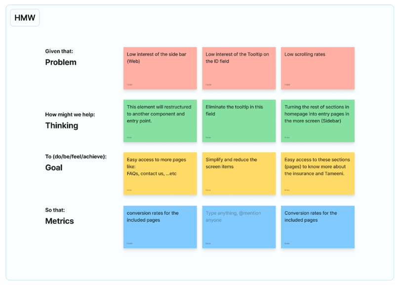
We kicked things off with How Might We (HMW) prompts. It's a simple but powerful technique that helps turn challenges into opportunity questions. For example, instead of saying "users are frustrated with the flow," we rephrased it as "How might we reduce friction in the quote-to-payment journey?"
To keep things focused, we mapped out the user journey from start to finish, identifying points of friction and moments of value. That helped us zoom in on the areas worth fixing or enhancing.
After several brainstorming sessions, we used Dot Voting to prioritize — a democratic and fast way to see which ideas stood out for the whole team. Everyone got equal say, and we focused our next steps on what really mattered.
We didn’t aim for perfection at this point, just clarity and momentum — knowing well that whatever we build next would be tested and reshaped in the next phase.
🧪Prototype
With the ideas prioritized, we moved straight into prototyping — not to perfect things, but to start visualizing what the new experience could actually look like.
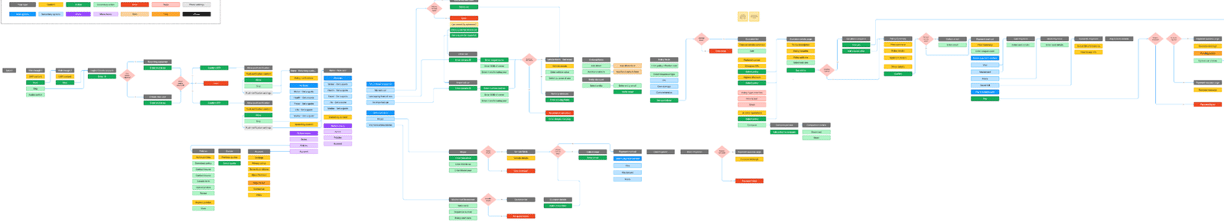
We began by defining the Information Architecture (IA) — the structure behind the screens. It’s what ensures the app makes sense logically, before worrying about how it looks. Once the IA was solid, we mapped out the "to-be" user journey, visualizing the new flow from entry to conversion.
Then came the wireframes, where we sketched out the layout of each screen — what shows up where, what’s clickable, and how the user moves between steps.
Finally, we built an interactive prototype in Figma, one that we could walk through just like a real app. This gave everyone — from stakeholders to users — something they could actually interact with and respond to.
It wasn’t about polishing the visuals. It was about testing logic, structure, and usability early enough to fix what’s broken — before writing a single line of code.

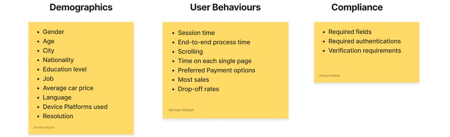
Demographic Segmentation and user behavior criteria
Focus groups selection criteria
How might we?
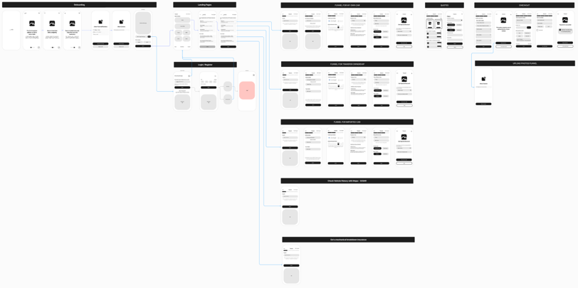
Information Architecture
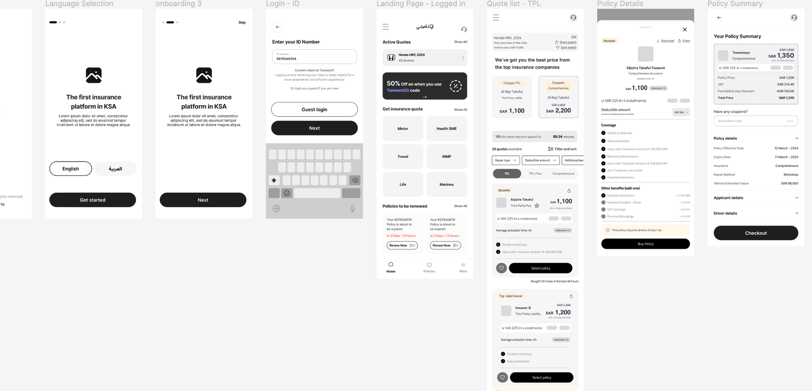
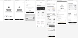
User flow and initial wire framing
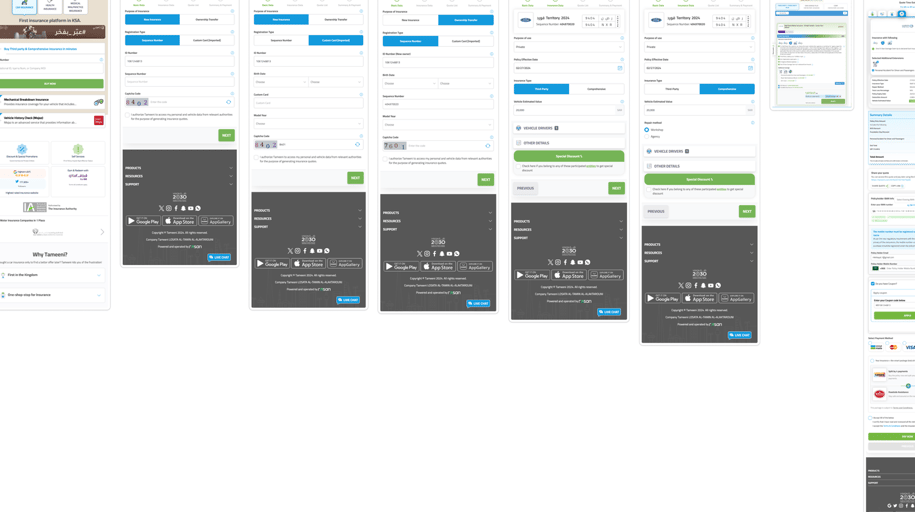
Final wireframe, layout, and flow
✅Test
Once we had a working prototype, we moved on to usability testing — the phase where assumptions meet reality. We wanted to validate whether our ideas made sense not just to us, but to the actual users who would be using the app.
We invited a selected group of participants to interact with the prototype and complete specific tasks, while we observed and noted where they got stuck, confused, or pleasantly surprised. This helped us identify friction points, missing guidance, and even unnecessary steps.
This phase was more than just ticking a box — it helped us see the design from the user’s eyes. We captured their feedback, iterated based on their behavior, and made several adjustments that made a big difference later on.
🔄 Outcomes
The final result? A much smoother and more intuitive experience. The revamped platform led to higher user engagement, better retention, and a noticeable 20% increase in sales conversion in the first quarter.